 TheLeader Business, Economy, Stock Market, Management

I own an American Express ‘Gold Card’ for many years and had never any inconveniences. And quite frankly, I wouldn’t accept anything else from a product that’s carrying ‘gold’ in its name.
Then, on a recent business-trip to Geneva, I met an old buddy of mine from business-school for lunch. After the delicious dessert, he insisted to cover the tab for the both of us and produced his own credit card.
‘Got it last year’, he said, ‘it’s the ultimate’.
His card was black and called the American Express Centurion card. Within the Amex product range this card is indeed the most exclusive, making my ‘Gold Card’ look like a Volkswagen ‘Golf’ to a Bugatti Veyron.
This made me think.. Not about how to get a ‘Centurion’ for myself, but why a company like American Express chooses black as the color for its top product – and ‘gold’ for a ‘middle of the road’ card.
Isn’t black the color mostly related to death and grief and often used with a negative connotation (blackmail, blackmarket, blackout, ‘Black Wednesday’ etc) while ‘gold’ usually is a symbol of success, for instance at the Olympics?
To find an answer, I dug a little into the color psychology. What I found is that color in business is much more than just a nice package, yet we often don’t realize the impact of our color choices. Color is essential, for instance when you are establishing a business profile or a website or advertise your product. That’s why I share ‘The Psychology of Color in Business’ here:
The infographic to this article (by the Masters in Psychology Guide) analyzes the colors used by major tech startups as well as by prominent consumer brands in their advertising. And it breaks down the branding color choices of the biggest tech companies. It also explains the impact that different color choices may have on both customers and employees.
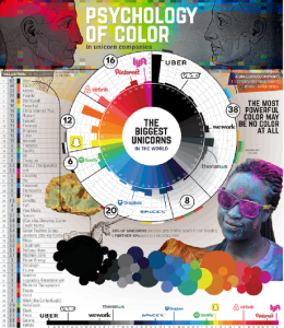
Unicorn colors
Out of the largest 50 unicorns – tech startups that have achieved valuations of over 1 billion USD – the most common primary branding color was black or grey.
A total of 38% of companies, including Uber, Vice and WeWork, rely on these hues for their outward appearance.
Blue is well-known as a strong business color, and it is no surprise that 20% of the top 50 unicorns focus on blue as their primary branding color. Dropbox and SpaceX are among the companies that are following in IBM’s “Big Blue” branding path here.
The red end of the spectrum makes up 16% of companies (including Pinterest and Airbnb), with yellow at 12% (including Snapchat), and green at just 6%. A green palette was least used for primary branding by unicorns, with Spotify being a rare exception.
It’s not just tech startups that key in on color to help differentiate their brands. Companies, including some of the best-known consumer brands, have focused on color in their branding, advertisements, and communications for years.
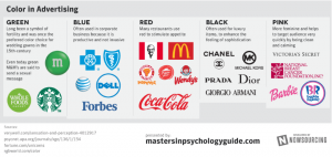
Red is a color that allegedly stimulates appetite. That may explain why fast-food restaurants like McDonald’s, KFC, Pizza Hut, Wendy’s, and Popeye’s all heavily use red in their brands.
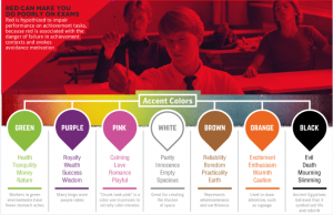
Black is all about the feeling of sophistication (and the answer to my Amex question). Some of the largest luxury brands in the world use black as a primary branding color, including Chanel, Michael Kors, Prada, Dior, or Georgio Armani.
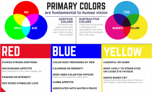
Blue is viewed as productive, but not invasive. It has been the color of choice for large corporate brands like IBM, AT&T, and Forbes.
Lastly, green is a symbol of fertility, and pink is chosen for a feminine feel.
To find out more about the effects color has on your brand download the ebook 7 mistakes most business owners make with their branding colours.
———————
Black is all about the feeling of sophistication and therefore the first choice for many luxury brands.